October 16, 2026

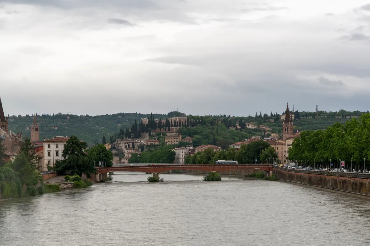
Spring on the river is a moving target. One morning the water is a flat pewter sheet; by afternoon it has turned a bright, almost acidic green, and the far bank is throwing light back at you in pieces. Anyone who has laid a mosaic beside that water knows the tiles chosen in February can look like a different material by April. The palettes below are working suggestions — colours, surfaces and small tests that keep a mosaic honest as the season shifts.
How Spring Light Behaves on the River
Winter light is low, amber and forgiving. It flatters warm tones and muddies cool ones, which is why so many studio decisions made in January turn out too brown. Spring light is a different animal: the sun climbs higher, the air carries less of that amber haze, and everything cool comes back into its own. Blues look bluer. Greys stop looking dirty and start looking like silver.
Two things complicate this. The first is new foliage — willow, alder and the first grass on the bank throw a green reflection that quietly tints everything near the water. The second is the river itself. Spring water is usually high and often carrying silt, so it is not the clear blue of a postcard but a warm, opaque grey-green or a milky ochre. That colour reflects up onto walls, bridges and the underside of anything built close to the bank.
Add the change of hour and you have a palette that shifts through the day: pale and cool at eight, almost neutral at noon, warm and slightly ochre by late afternoon. A mosaic that only works at one of those moments will disappoint you at the other two.
Five Spring Palettes to Start From
Treat these as starting points, not recipes. Each assumes a dominant field, a supporting tone and a small accent — the proportions matter more than any single tile.
1. Thaw Water
Pale grey-blue, celadon, oyster white, with a single thread of silver running through it. This is the palette of a cold river under a bright sky, and it works best with very small steps between tones: three or four greys sitting within a shade or two of one another. Keep the field matte and save gloss for the movement — a streak, a ripple, the edge of a reflected branch. Too much gloss and the whole panel blows out into white at midday.
2. Willow Bank
Willow yellow-green, moss, the young beech green that exists for about three weeks, softened with sage and anchored by a warm grey or a buff stone. Greens are the hardest family to keep from turning acid, so pull one tone toward brown and another toward blue. A few iridescent gold smalti read as sun caught on wet leaves; more than a few and the piece starts to glitter rather than glow.
3. Flood Silt
Ochre, buff, pale terracotta, clay and sandstone, cut sharply with one cool slate blue. This palette is underused and it earns its keep in early spring, when the water is opaque and warm and the banks are still bare. The blue is not decoration — it is the thing that stops the earth tones from becoming a mud wall. Use it sparingly, in lines or on the shadow side of forms.
4. Morning Mist
Off-white, dove grey, a pale lavender, a barely-there rose, and one dark line to hold the structure together. Low contrast, high subtlety. The risk is blandness, so build in texture: mix matte vitreous with a rougher stone, vary the size of the tesserae, and let the dark line do real work. This suits a sheltered wall or an interior that gets soft morning light, not a surface in full afternoon sun.
5. Blossom Accent
Hawthorn pink, magnolia cream, a deep plum. These belong in the accent layer, roughly five to ten per cent of the surface, never as a field. Pinks go chalky beside pure white, so pair them with cream or warm grey instead. A single branch of plum against a Thaw Water field will do more than a whole wall of blossom.
Matching Tile Surface to Seasonal Light
Colour gets the attention; surface decides whether the colour survives the season.
- Gloss glass and smalti bounce light and read as water. In strong spring sun they can also flare, flattening a carefully built value range into one white shape. Keep them for highlights and small areas facing away from the main light.
- Matte vitreous glass and unglazed porcelain absorb light and hold their colour through the day. They are the safer field material in bright rooms and on south-facing walls.
- Iridescent smalti shift with the viewing angle, which mimics the flicker of a river surface. Use them as a deliberate line or patch; scattered at random they read as noise.
- Stone carries the cool whites and warm buffs that glass cannot fake. Marble, limestone and travertine are porous, so for outdoor work check frost resistance and consider a penetrating sealer — and ask a supplier or conservator if the piece will sit near constant splash.
Do not overlook grout. A light grout lifts the whole panel by a value step; a dark one outlines every tessera and adds contrast you may not want. Mid-grey is the neutral compromise, and it is worth making a test board with two or three grout colours before committing.
Building a Palette That Holds Together
Most weak spring palettes fail on proportion rather than on individual colours. A simple working ratio keeps things in order:
- Around 60 per cent dominant — the water or sky tone that sets the mood.
- Around 30 per cent secondary — bank, stone, foliage, the things the water sits against.
- Around 10 per cent accent — blossom, sunlight, a flash of silver.
- One dark — basalt, slate, deep umber — to give the eye somewhere to rest.
Then repeat at least one colour in two different materials — a green in both glass and stone, say. It ties the surface together and gives the light two ways to catch the same hue.
Testing Before You Commit
- Lay the tesserae out loose on a board, in the real proportions, and carry it outside. Never judge a spring palette under workshop lighting.
- Look at it at eight in the morning, at noon and at four in the afternoon, plus one overcast day. Note which version you actually like.
- Photograph it in black and white. If the value structure disappears — all mid-grey, no light, no dark — the palette will look flat at a distance whatever the colours are doing.
- Spray the samples with water. Wet tile and wet grout change the reading, and a river wall is a damp environment.
- Set the gaps. Matchsticks or plastic spacers at your intended grout width will show whether the lines are doing too much work.
- Record the batch codes and order roughly ten per cent more than you need from the same batch. Dye lots vary, and the corner you add in June should match the field you laid in April.
Keep a Spring Sample Box
Spring palettes are easy to lose. The green that looked perfect in the first week of May is gone by June, and by the following February you will be guessing. Keep a shallow box of the tiles you approved, labelled with the date, the time of day and one line about the light — "overcast, high water, looked right" is enough. Photograph the box outdoors and keep the image with your working notes.
Then do one more test: hold the palette against the same view in July and again in October. A spring mosaic does not have to shout about spring all year. It only has to keep its structure as the light changes, so that the silver still reads as silver in midsummer and the silt ochre still has somewhere cool to rest. Choose for the season, but build for the twelve months around it.
Photo: MARTINOPHUC / Pixabay